Client Background
Le Yeahllow is a premium cake shop situated in South Yarra. Their cakes are renowned for their unique appearances and tastes, with each one crafted with care and new creations introduced seasonally.
After several years of development, the owner of the shop has decided to open a new store in the CBD. They have already invested in renovations and construction to make this a reality.
With the opening of the new store and the aim of enhancing its brand value, Le Yeahallow planned to bolster its brand image by launching a new online store.

Client Pain Points
Le Yeahllow's store owner used to have an old branding system and a Shopify online store that he had built himself. However, he felt that the store's visuals were outdated and didn't align well with his brand's goals. To rectify this, he hired professionals to design a new brand visual system and then they found us to help them build a new online shop.
The goal is to use these new visual elements to revamp Le Yeahllow's online brand image and differentiate it from other "average" conventional cake online stores.
The challenges we faced
The store owner is aiming for a “distinctive brand identity” and has cited Black Star Pastry as a competitor with a strong visual presence. Black Star Pastry's website boasts modern and stylish design elements that leave a lasting visual impression through entrance animations, interesting interactions, and consistent illustration style, thereby enhancing its brand value effectively.
When we asked the store owner what brand identity keywords he was pursuing, he gave us "high-end, elegance and fun". He emphasised that he wanted a unique "theme" to immerse users into the brand's "worldview" and to deeply imprint the image of Le Yeahllow in the minds of viewers. However, he was unsure of what kind of approach they should use to digitally convey this special experience to customers.
Timeline
Our team was composed of a designer, a project manager, and a front-end engineer who assisted in adjusting the code. It took approximately 3 months from the initial client contact to the finalization of the design draft and completion of the website construction. I was involved in every stage of the process, including discussions with the client, design presentations, and delivery of the final outcome. Throughout the project, we ensured to establish excellent communication with the client in order to fulfil their requirements.
Design Process
Desk research & competitor analysis
To gain an understanding of the current situation of local cake shops in Melbourne, I conducted research on the most popular and highly ranked cake shop and bakery websites. Upon analysis, it was found that most of the websites used relatively simple and traditional designs. Furthermore, there are only a few stores that have invested significantly in enhancing their digital brand image, such as Black Star.
We thoroughly examined the sitemap, information structure, required elements, and typical user flows of similar websites to establish a solid foundation for subsequent design.
Initial idea proposal
In the early stages of the project, in order to reach a consensus with the client, we made an initial idea proposal to confirm with the client our project goals and final outcomes.
We listed the main goals for this project:
- Improve user experience
- Create a brand identity
- Improve visual design
- Keep maintenance low
We also showed several food e-commerce websites with different visual styles and discussed with the client their preferred visual direction and animation

Use mood boards to confirm the visual theme with client
We had several options to choose from when it came to selecting the appropriate visual styles and interactions that would effectively convey our client's brand identity. Our clients provided us with a new branding system that could be summarized by keywords such as Creative, Playful, Modern, High-end, Elegant, Luxury, Celebratory, and more. Our task is to identify and extract 2-3 keywords that will serve as the style guide for the website design.

The client chose the theme of Modern Art Gallery and we decided to construct the entire website as a single coded page with interaction + a Shopify store structure. Use an eye-catching single web page with interactive and animated effects to leave a creative image, and then lead users into clearly structured stores with consistent visual elements to complete a smooth shopping experience.
Design sketch
After confirming the theme of the website, I considered two different approaches for designing the first page. The first approach involves presenting the cake products in the form of a multi-grid, resembling paintings hanging on the wall. The entire first page will be displayed on a single screen. The second approach is a common long page with multiple sections. The first screen will only display a single cake, highlighting one product at a time, and upon scrolling down, different categories of cake products will be displayed in sequence.
In the end, the client chose to use a multi-grid display and a single-screen page for the store introduction.

Website building
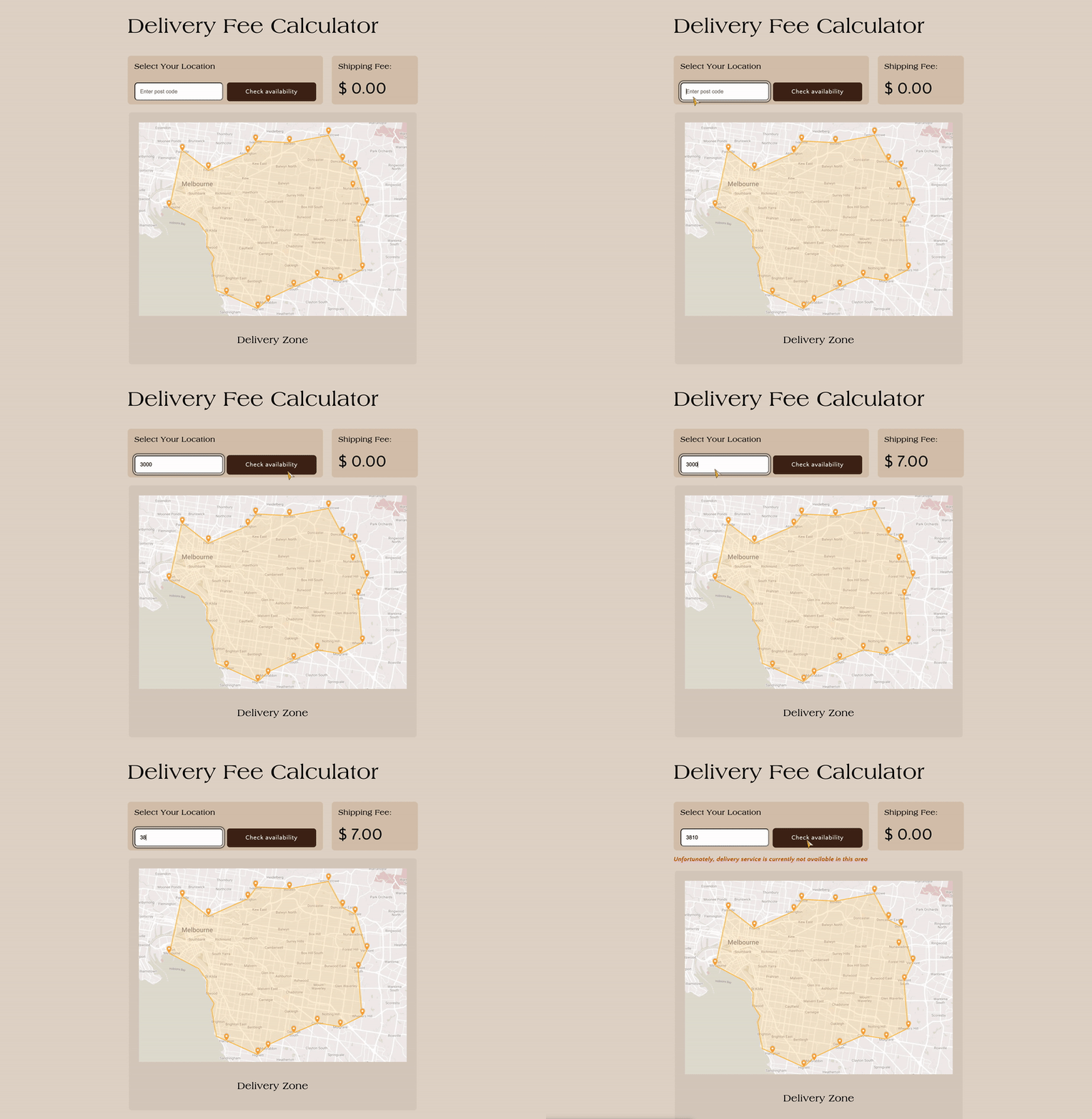
I took charge of building most of our website using the Webflow and Shopify platforms. However, there are some pages that require code modifications to achieve the desired interface. I designed these pages and worked with our front-end engineer to make the necessary modifications. Once the modifications were complete, I performed acceptance testing to ensure the changes were implemented correctly.

Some examples of page customisation


Animation
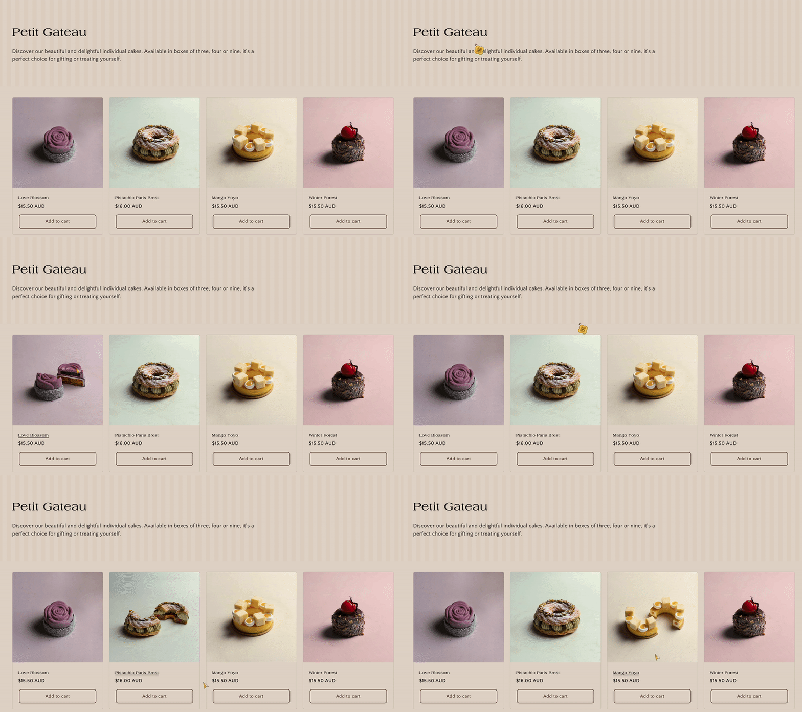
In order to present the characteristics of "elegant" and "fun" simultaneously, in addition to paying attention to the graphic elements, many dynamic features were added to experience the fun through interaction. For example:
- The paintings hanging on the wall will be rearranged every time the page is refreshed.
- The introduction of each "painting" will be flipped and displayed when the mouse hovers over the image.
- The ribbon actually used by the store for packaging moves in the opposite direction on the top and bottom of the page.
- The flower-like logo rotates on its own, etc

In order to strengthen the brand impression and interactivity, I also set up a customized cursor. When the mouse hovers over a clickable image or text, the cursor will change.

Mobile Responsive
Mobile phones have become a popular means of accessing online stores, and as such, we have made continuous adjustments to the display effects on different mobile devices in our design. Except for Webflow's introduction page, Shopify's adaptability also requires many modifications due to the addition of design.


Results after the website launch
After the new website is launched, the following improvements have been observed based on client feedback:
- A substantial uptick in online store visits.
- A significant boost in online sales.
- Positive feedback from both new and existing customers regarding their perception of the redesigned website.
- The store manager has noted that the new website's format is more effective at recommending new and core products.
Thoughts After Project
This project marked my inaugural opportunity to shape the entire online store's visual concept, drawing from the comprehensive branding materials furnished by the client. It also represented my debut in presenting diverse visual and interactive concepts to enhance the client's digital brand image, including coming up with themes like Modern Gallery, Vintage Garden, and Southern France, among others.
Throughout this journey, I maintained a constant vigil over the brand's products, historical context, store environment, and other influential factors to deeply grasp the brand's essence. I engaged in ongoing discussions with the store owner, endeavouring to capture the brand's unique qualities. In terms of user experience, I dissected the typical structures of comparable cake shops and incorporated the owner's insights into consumer behaviour to shape the current sitemap. Additionally, we proposed a new cake categorization system, focusing on occasions, to facilitate product discovery for consumers.
The journey wasn't without its share of technical hurdles. Notably, I encountered challenges with Webflow while creating animations, requiring meticulous attention to detail to pinpoint and resolve the issues. Patience and valuable guidance from experienced people are important in overcoming these obstacles. Following the website's launch, we gained feedback from store staff and promptly adjusted elements such as the shopping cart and special product pages.
Overall, this project was not only a valuable learning experience but also bolstered my confidence in future branding-related projects.
If you're interested, here's the link of the website 👇🏻
